Sign up here for a $20 Welcome Voucher | Free Shipping Worldwide with minimum spend


SPOTLIGHT

Minding Colors

Far beyond mere patterns on fabric, prints are a dynamic expression of creativity, a language that designers use to add vibrancy and narrative to the canvas of style. For IN GOOD COMPANY, the foray into prints was a deliberate move, serving to infuse its collection with a sense of vitality.

SPOTLIGHT

Minding Colors

Category:
Spotlight
Tags:
Minding Colors

Far beyond mere patterns on fabric, prints are a dynamic expression of creativity, a language that designers use to add vibrancy and narrative to the canvas of style. For IN GOOD COMPANY, the foray into prints was a deliberate move, serving to infuse its collection with a sense of vitality.

This debut collection of prints was worked in collaboration with budding young artist, Karuna Chua, who approached the project with the idea of seeing nature though the mind’s eye. The result was a tapestry of opulence and innovation, showcasing unexpected hues on tried-and-true fabrics.

Delve into the design process and inspiration behind these exclusive prints as we speak to Karuna, who shares his unique perspective that fuelled this creative endeavour.


First things first, tell us how did you landed on this project.

IN GOOD COMPANY had just started a year round partnership program with Nanyang Polytechnic as an initiative to foster young design creatives and I was the first one selected from the graduating cohort to undertake this apprenticeship.

Tell us a little about the experience with IN GOOD COMPANY?

I majored in Visual Communication for my diploma, so naturally I was very curious what I would be working on for a fashion brand. When I was given the creative brief to design the prints I got really excited. In my mind, there were so many possibilities! I always thought this project was like a meeting point between Arts, Design and Fashion.

How did this idea of prints/colours and fashion come about?

It was my first foray creating prints. I worked closely with Creative Director, Sven to understand the aesthetics of IGC, to always think with a modern approach. There was a lot of creative freedom and very little rules. We experimented with different themes and techniques. It was a lot of trial and error, and I had to change my mindset to understand the level of refinement required. Honestly, it was unlearning and relearning that the appeal of the prints will reflect certain nuances of taste. They need to tell a story.

Tell us what your inspiration was for this capsule with IN GOOD COMPANY.

I had 2 things in mind: Nature and Escape. For me, landscapes are a form of escape. Through the use of colours, I wanted to express the feeling of being transported from a physical place to an emotional state when one is engulfed in the vast beauty of nature.


The ORORA Cupro Dress in Elio Print

Why did you choose this range of colours (three different ranges)?

The first print “Elio” was the first few prints produced. Elio in Greek means the sun, and to me, it symbolises the boldness and strength of the radiating sun. 

For this print, I wanted to reflect the strength and power of the light through a spectrum of highly saturated colours. The warmth we feel from the sun rays even if it’s from the bright and burning sun.

“Beyond the fragile greenery lies a forest that travels deep… between us and the dark intensity of the forest are the familiar blue skies that guide us along our way.”

The HINODE Taffeta Dress in Dawn Print

For the second print “Dawn”, I had a vision of boundless fields in my mind. Beyond the fragile greenery lies a forest that travels deep… between us and the dark intensity of the forest are the familiar blue skies that guide us along our way. This print symbolises the odd serenity that one feels when we peer into the unknown but the hope that we feel when we see a new day dawning.


The ORLANDO Jacket and RITA Pants in Dusk Print

“Painted on the canvas are the colours that stand between the emptiness and serenity like the auroras in the night sky.”

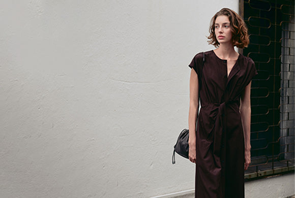
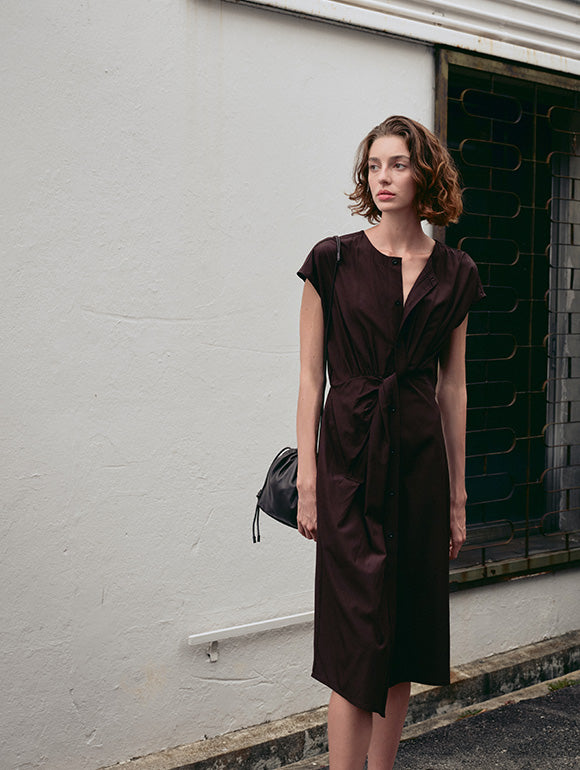
The third print “Dusk” signifies that there’s a peace that looms over. Painted on the canvas are the colours that stand between the emptiness and serenity like the auroras in the night sky. The routines that we repeat through the night are what creates familiarity — something that gives shape and form, staring into a void of night, and hint at colours which we cling onto.

Often, I will feel this odd serenity when I look at awe-inspiring scenery. A feeling of fear mixed with beauty. This same feeling dawns upon me too when times are tough. I liken it to when people say this phrase: “The calm before the storm”. You’re oddly calm but also afraid of what’s to come.


“These three prints represent the story of the unknown and one of hope in each print.”

You also used hand renderings with digital techniques. Tell us more about that.

To start off, I experimented with different techniques to create a series of textured bases that will complement each print. Most of these textured bases consist of hand drawn renderings, where every stroke is meticulously rendered. I then make use of a digital app where the textures are layered, smeared and blended with colours. The latter process is experimental in the sense that it was impossible to control it fully and I must have tried and tested a few hundred times to get to the final version.

What goes through your mind when you’re creating these prints?

It was a sense of balance and harmony, in colours and composition. Using them as a medium to depict the abstract grandeur of nature, and also to express what I was feeling viscerally at the same time.

What would you say is a key takeaway from this project as a young creative?

I am thankful for the opportunity and the openness in the creative freedom given for the project. Beyond the project, I am grateful for the opportunity to work alongside some of the best creatives in this industry. Observing and learning from them had a significant impact on how I look at things.

Discover the limited edition collection now.

More Stories

Collaboration

On The Road Less Travelled:
Krystal Tan

Every wardrobe has its staple, as does every life its narrative. For many, it's a relentless pursuit of more. For others, it's about seeking an escape. We speak to Krystal Tan, Co-Founder of Blue Sky Escapes, as she shares about her adventure of a lifetime. Every wardrobe has its staple, as does every life its narrative.


Spotlight

Behind the Seams

Located in Taixing, a country-level city in Jiangsu province, China, the illustrious IN GOOD COMPANY production facility is a three-story country house nestled within a quiet farming community.


Collaboration

Clay Camp 2023:
Mud Rock

Every wardrobe has its staple, as does every life its narrative. For many, it's a relentless pursuit of more. For others, it's about seeking an escape. We speak to Krystal Tan, Co-Founder of Blue Sky Escapes, as she shares about her adventure of a lifetime. Every wardrobe has its staple, as does every life its narrative.


Impact

FASHION for CANCER

This August, IN GOOD COMPANY was proud to present our new arrivals at Fashion for Cancer (FFC), a special charity fashion showcase - Let’s go behind the scenes with Yan, some of the cancer survivors, and a few of the powerhouse individuals who have given their time and expertise to support this meaningful cause.